Spying on PocketPC
PocketPC
 I went. I saw. I espied the new Windows Pocket PC. I went. I saw. I espied the new Windows Pocket PC.
Yes, yours truly was a spy at Microsoft eXtreme where the kind folks at Redmond previewed their new Pocket PC. Theoretically, they were just demonstrating the software and not the actual device as that is something their production partners (HP and Casio and the like) will do when the product debuts on April 18th.
However, it is pretty hard to demo software and not inadvertently demo the hardware. So Ill start there first. Again, this is conjecture based upon the glimpses I had of the machine as they demonstrated it and the necessary functions because of particular software. The rest can be extrapolated from previous models and common sense.
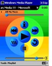
 Of course its in color. It looked like a beautiful screen. Of most interest to the Visor crowd is the compact flash expansion slot on the top. There also seemed to be a rocker type switch on the side. I never got a glimpse of the face buttons, but assume they are similar to current offerings: address book, note pad and the like. There is also a headphone jack and volume control. The presenter ripped a Bruce Springsteen song and wrote it to compact flash and played it on the device using Windows Media Player. Of course its in color. It looked like a beautiful screen. Of most interest to the Visor crowd is the compact flash expansion slot on the top. There also seemed to be a rocker type switch on the side. I never got a glimpse of the face buttons, but assume they are similar to current offerings: address book, note pad and the like. There is also a headphone jack and volume control. The presenter ripped a Bruce Springsteen song and wrote it to compact flash and played it on the device using Windows Media Player.
I assume there is a built in Microphone as well. The unit looked very, very thick. Essentially they crammed a little computer into a pocket form. She said nothing about battery life. I assume it is like, two seconds. It must run off rechargeable for a couple of hours.
Okay, software. They moved the start button to the upper left hand corner of the screen. Something about usability studies
. I just want to say that the contrast between this presentation and Jeff Hawkins demo of the Visor (at InternetWorld last autumn) is astounding. Hawkins is passionate, clear spoken, and just has a whole lot of common sense. The drones from Redmond prattle on and on about usability studies.
That said, I was fairly impressed with the machine. They seemed to be aware of some of the shortcomings of the current WinCE models. It seemed noticeably faster and somewhat easier to navigate. I dont recall any cascading menus. More point and click to get something running. I also admire the fact that text recognition pops up when and only when you ask for it and otherwise does not take up valuable screen real estate. Those of you who read my last article will remember that this was a particular beef with the Visor.
Text Recognition >>
|
 |
 
Update: Auction Update / VisorAdventure 2
Thu Oct 11 - 12:05 AM EST
InnoGear PowerCradle (updated)
Tue Oct 9 - 10:51 PM EST
iambic Office suite
Thu Oct 4 - 1:12 AM EST
Prism dropped to $299
Tue Oct 2 - 6:19 PM EST
New Portable Keyboard
Tue Oct 2 - 4:46 PM EST
MORE
NEWS >>
 
VisorCentral Awards 2001 - Day 11
Mon Oct 8 - 8:29 PM EST
Mr. Hromadka goes to Redmond
Mon Sep 10 - 4:39 AM EST
WordSmith 2.0 Preview
Tue Jul 10 - 9:06 PM EST
Open Desktop
Sat Jul 7 - 11:56 PM EST
VisorVision Explained
Mon Jul 2 - 12:10 AM EST
PC Expo Video Streams
Fri Jun 29 - 5:18 PM EST
MORE
ARTICLES >>
|

 I went. I saw. I espied the new Windows Pocket PC.
  Of course its in color. It looked like a beautiful screen. Of most interest to the Visor crowd is the compact flash expansion slot on the top. There also seemed to be a rocker type switch on the side. I never got a glimpse of the face buttons, but assume they are similar to current offerings: address book, note pad and the like. There is also a headphone jack and volume control. The presenter ripped a Bruce Springsteen song and wrote it to compact flash and played it on the device using Windows Media Player.